
So I am taking a shot of changing the Font and I need your help. The first one is the one I already had and the other two are the new variations. If you can vote which one you think represents my work well and why, I would really appreciate it. You can Vote for the first one too, if that is what you think works the best.
___________________________________________________
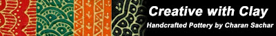
Banner1
___________________________________________________
Banner2

___________________________________________________
Banner3

And that is not all. I am also giving away one of my small square dishes by selecting a lucky draw from the comments.
30 comments:
Wow, your shop is gorgeous! I like the general concepts of the banners. I like the fonts of #2 & 3 a lot! I think it would look better with a soft gray instead of black for the background, sort of like the backgrounds in your shop. I really think the best thing for the banner and especially for the business cards would be to use some of the gorgeous photos from your shop in the background. Your products are spectacular, and your photos are great, so may as well show them off! Has the added benefit that people will remember your work more from the business cards, and they may pique the interest of those who have not seen your pieces before (I know this has worked on me with item photo business cards before)!
Anyway, good luck with this!
xo, Michelle
Charan - I like #2 - it is consistent in style with yoru work, and I can read it easily. I find #3 a little harder to read.
I can read #3 the easisest. Looks great! I also think a softer color for the background would be interesting to try.
Charan- I like #2 as well. I think the lines above the letters on #3 kind of get in the way.
I am voting for #2. The font style compliments your style of work while remaining easy to read. Love your work and all your posts!
Charan, love your work and I vote for #2, easy to read and goes with your work. Funny, I am making similar little plates right now. Fun!
I like #2 the best. I find #3 a little hard to read.
#2 (although I like #3 as well) - but 2 is less busy and easier to read.
Loving your work!!
I like the font on banner 3 the best. The lines reminds me of your signature on the bottom of your pots. Also don't think you should use the same font throughout -- it's too much. Maybe the title could be in the stylized font of banner 3 but the tag line would use the font in banner 1.
As a graphic designer and an owner of a marketing/design company: no. 2 is the best for your business...easy to read and the (Marker Font) is perfecto for your beautiful hand work :) dar
Beautiful work, Charan. I think #2 is the better of the three. It gives us an attractive font that represents the style and origin of your works and I find is simple and easy to read. #3 is very nice but I think its a little more of a strain to read.
I like #2 the best for the font. What if you used any of the colors from your plates as a background for the font - it would read a bit better, think. Beautiful work!!
I like #2 the best but the second line is a little harder for me to read. Maybe title line with font 2 and second line with font 1.
I think Banner # 2 looks great. Its easy to read and has that artistic feel to it.
banner 1's font doesn't quite fit the character of your work..
I like 2 is better, but its harder to read
of the 3, I like #3 the best.. Has flair that looks best with your work and is easy to read.
nice job.
i was thinking of your work, technique, and traditional patterning when I was reading about mehndi the other night.
Cheers!
(Can you please make commenting open to people who don't have just google or openid? I host my site & blog on wordpress.org and neither apply. Thx)
Anne W (webbpottery)
I love #3 but find that it is too intricate and many would find it cumbersome to read and understand.
#2 is just perfect to highlight the Indian-ness of your work and is apt representative of your culture.
Good luck !
Definitely #2 as well... as others have said #3 is a little difficult to read easily, although it is not bad. Your work is beautiful!
I agree, a new font would reflect your style a little more. I have to go with #2, as the overline in #3 is distracting.
I like number three, has an arabic feel to it. It is also very natural like clay itself.
kmcgiveron@shaw.ca
My vote goes for banner No. 2 also. Love the font!
banner # 2 is my fav
The second one seems to be the best combo of Indian feel and Western view of legibility. ^_^
I like the original banner, but it is true that banner #2 suits your work. I do agree with one of the posters who suggested using the fancy font for the name Creative in Clay, but the original for your name (the second line of text).
Charan, I like #2 fits with your style but easier to read for me than #3. Personally I like the black background to make the colors pop!
I like the 2nd banner the best - I must admit I don't like the way the line runs across the font in the 3rd banner.
Lovely banners, all! I personally would put your shop title in the font used in #2, but put "handcrafted pottery by Charan Sachar" in the plainer font used in #1 (or something similar).
Lovely work!
Voting for #2 here. Definitely suits your style, but in agreement with using the more plain font for line 2.
Thank you all for your valuble comments. The winner is Frost Indri.
You can check my new banner selection on my blog.
I like choice #2. It is easy to read and hints at the type of art you create.
one is sweet ,
it would catch my eye,
walking down the street,
i'd stare and sigh
three's far out,
with that line on top,
what to think about,
it'd make me stop
two's my pick
and ill tell you why
it's funky it's slick
it would make me buy
Post a Comment