
The ones which I have are not that great and this time I wanted them printed both front and back.
Another thing I wanted to try was doing a vertical orientation.
And there is something for you to gain in this too. Please comment in whether you would like Vertical or Horizontal design and also tell me why. And if you would change something what would it be.
Two random people will be chosen to receive my heart shaped pendant (See picture below). So this is a Win-Win situation!
Winner will be announced on Tuesday August 17th, so start posting your comments!
I really appreciate your inputs!
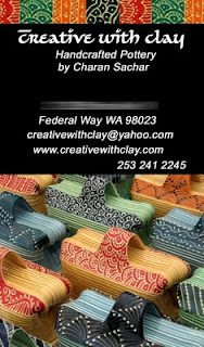
PS: Blurred area is where my address will appear.
Vertical Option:


Horizontal Option:


35 comments:
I like the horizontal one best.
Hi, Charan, I like the vertical orientation the best, although it was really hard to choose. I think the vertical appealed to me more because of the single image on the flip side. I am attracted to the human form and therefore more inclined to look further. Even though the horizontal design gives a great overview of your work, it's not as powerful and compelling an image.
I think the vertical is much more striking and would catch my eye right away.
Hi Charan,
I really love the vertical option.
I like the horizontal one better as well. The patterns mirrored on top and bottom are better than the picture of the butter dishes. I think they get lost and passed over as another pattern instead of being recognized as pottery. Also, I like that you have more images of your work on the horizontal one. It gives people a better idea of what you do if they have never seen your work before.
I like the horizontal one.
I might as well post my opinion on both designs.
Horizontal Pros: I get more pictures of my work
Horizontal Cons: On such a small card 5 images of my work get too tiny showing very little detail. The front of the card looks kind of boring
Vertical Pros: First glance you can see my work and can see the detail. Gives better detail view of my decoration.
Vertical Cons: Font size gets a little reduced. Only two pictures of my work.
I guess you can;t have everything.
definitely the vertical... even though that orientation is becoming more popular it still stands out from the crowd. the pictures are a great representation of your work.
I think that the vertical one is unique and eye-catching. The horizontal one just reminds me of so many other business cards. Good luck with your decision.
I agree with your assessment, Charan. All of which weighs more heavily toward the vertical because of: the detail, the immediate image of your work, and the striking beauty of the human form on the reverse.
Those two images show the variety of work you do, better than all of the smaller pics.
But, I would also advise you to create an email address @creativewithclay.com rather than @yahoo.com. It adds a level of professionalism, even if it's sales@ or orders@ or just charan@.
Keep up the awesome work!
Blessings,
Jim Bob
i like the vertical too. although i really like the multiple images on the back of the horizontal, on a business card perhaps the single image would be easier to see. :)
I like the first one better.
Overall I like the vertical design better, but I previously had vertical cards and had difficulty getting them to stand up in card holders and that type of thing. As an artist, I think printing/photos on both sides is a must. Both look so good, it's hard to choose.
I too like the vertical, but I can see what Rob was saying about the butter dishes and the top banner of the card. What if you made the top banner maybe 1/2 again as high and took the difference off the butter dishes picture. That might balance it out a little more.
Both are beautiful, however I prefer the vertical.
Jacqueline
Both are nice, but I prefer the impact of the vertical one.
Jacqueline
Charan, I like the horizontal version better because it is easier to read your information. It is a hard choice, though. Wonder if you would consider doing a hybrid, with your name & address on one side in horizontal format, and your gorgeous dancing diva in vertical format on the reverse?
I really like the vertical option. But the ultimate choice is yours.
I think the Vertical Option is much classier:>)
I love the idea of the vertical card. However, I like the horizontal option because you showed more of your work on the back. So I would say if you go vertical I think you should put more work on the back instead of showing 1 piece.
Hi Charan,
I prefer the vertical orientation because it's cleaner, meaning I like that there's just one image in the front to focus on. I think it's more important to have one piece that really shows off your work instead of lots of smaller images where details get lost. However, the contact info on the back feels a bit cramped.
Hi Charan,
I like both designs very much and always love verticle formats just because they are different. The only thing I am concerned about on the verticle is that your business info and name are not large enough. So I would have to vote for the horizontal. This one show cases your business name and info, plus a great selection of your pottery.
I have to go with the horizontal one because it looks more unified. The front of the vertical one bothers me. It seems like the banner and the butter dishes are competing for attention.
I would think that in a business card you wouldn't need too much detail. It's like a tease.... just something to get people interested. Then you have your contact info so they know where to go to see more things with more detail. You have a nice range of pieces on the horizontal one and everything plays nicely together.
And I wanted to say thanks for the slip trailer cone instructions. I'm testing them out now to see how they work for me.
Hi Charan,
I like the horizontal front with the photo of the butter dishes on the other side.
Hey Charan!!!! I'll have to go with the Horizontal design. People are used to reading a biz card in the horizontal position. The vertical is nice but didnt grab me!..... Jed
The vertical is interesting because it is unexpected. But, because it is unexpected, it does not fit into conventional storage systems--and that could be a real negative for those you wish to keep your card at hand. So, I suggest using the expected horizontal format. Both are lovely--as is your work.
Larger Type is always an advantage so it can be read more easily. I too Love the human form, might you consider horizontal w/type and vertical on reverse? Adds intrigue and may encourage someone to hold the card longer, consider it further....
Hi Charan,
I like the vertical one better because it gives a very good idea of your style, yet it isn't as packed as the horizontal one. The front side gives a pretty good idea of your colorful style and the fact that there is only one item in the picture arises the curiosity of your potential customer to contact you or visit your web site.Sometimes less is more, I feel that the horizontal card has too much visual information.
I don't like the black background so much and would try maybe something much brighter (maybe offwhite even?)
Good luck!
I love your diva, it's has the movement and detail that your characterizes so much of your work. On my cards, I have the horizontal on one side for readability and a single vertical image on the reverse. Best of both worlds!
I like the front of the vertical card, but the back of the horizontal card. I like being able to see more examples of your work, which the back has, but I like the flow of the diagonal imagery on the front of the vertical card.
I like the vertical front (with the single stunning picture), but why don't you use the horizontal back (name,address,info) with it? I like that for the back because it is easier to see the text and get the information I am looking for.
Stunning design along with eye captivating shades...your skills inspires me a lot...
Most of the business card scanners can be used to scan and digitize identity cards, photographs, data on cards and receipts. Different types of business card scanners have different types of software.
This is absolutely awesome.
Get business card and credit card holder at giftipedia.com. Click on following link to know more about it http://www.giftipedia.com/divine-card-knife.html
Post a Comment