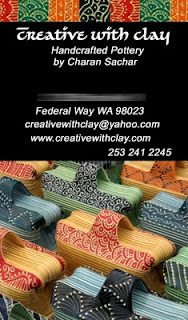
The votes for the vertical and horizontal were really 50/50, each with its pros and cons, so it was a tough decision for me.
Even though I liked the vertical more when I posted the two designs, I have gotten convinced to go with the horizontal design with the input I have got from all of you.
The vertical had many challenges.
Firstly the font of my information gets reduced and if the purpose of a business card is to communicate your contact info, it should be clearly visible.
Several mentioned about it not having a conventional convinient way to store and look up.
Even though the detail of my work was very visible, I have noticed that several people don't recognize the picture of my butter dishes. It is eye catching, but several ask me.."What is that?" And with the sculpture picture behind, my functional work is not showcased very well.
To remedy that I tried including a few more pictures of my work in the vertical design, but the orientation just didn't work. Everything got too tiny when I looked at a printout.
I tried front horizontal and back vertical, and that felt like there is an error in printing the cards.
So I am going with the horizontal design.
I moved around my addresses and website, so the info side looks more balanced.
Made changes in the images.
Removed the Black background and went with a gradient instead.
Here is the final design.


